

Consulting is a fast-paced and rewarding environment, in stark contrast to the iterative and perfection-chasing product design environment. But one thing is constant and should be a top priority: Accessibility. Trying to come up with the coolest and innovative design tends to leave accessibility considerations behind. As a designer I had to break the habit of light grays on white (a contrast visibility no-no), among other design-y habits that were not the best for accessibility.
Here at XCentium, we work on numerous Financial Technology, Medical & Government solutions. Needless to say, WCAG and ADA compliance is a top priority. Coming from a specialized background of product design & product development, it would be an understatement that I had to brush up on accessibility. Luckily, I have surrounded myself with specialists in the field and continue to research ways on how to optimize our solutions as well as stay current with best practices.
You may ask, can designing for accessibility hinder innovation? The quick answer is no, it SHOULDN'T. Designing for accessibility doesn't block innovation or creativity. All it does is require you to work within some boundaries - boundaries that can actually make you think OUTSIDE the box. After all, the goal is to come up with solutions that caters to the wider audience - and serve the information efficiently and dependably. With that said, here are some things to consider:
CONTRAST
One of the considerations to always start with is contrast - that's making sure your text stands out from its background. The goal is to have a 4.5 to 1 ratio for a AAA rating (WCAG). For text 14px or smaller, bold is recommended as well as if the text overlays imagery (along with other ways to provide contrast from the background).

Using plugins to check contrast ratio is one way to validate compliance.
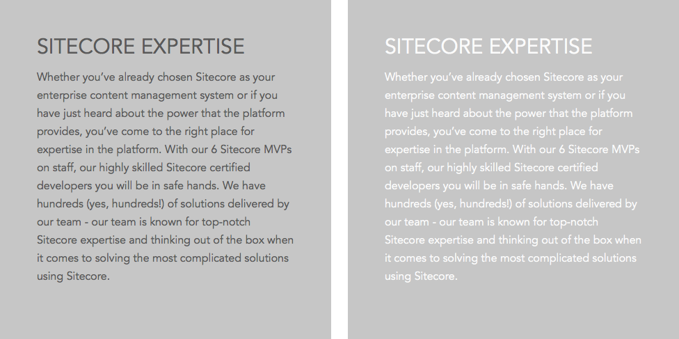
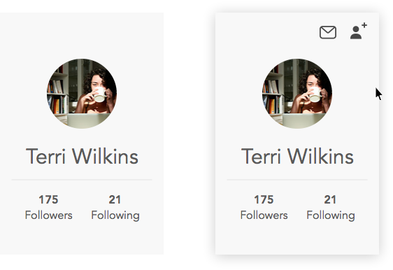
With the same background, which option would you choose for more contrast?
Source: W3C
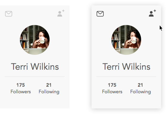
Custom Focus States
For keyboard users, focus states should be clear and recognizable. Although some browsers have default focused states - it's highly recommended to design a custom solution for this.
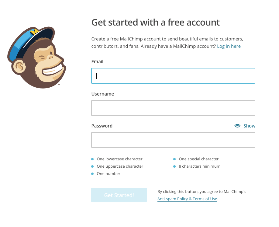
MailChimp uses custom focus states to really make forms stand out (Chrome)
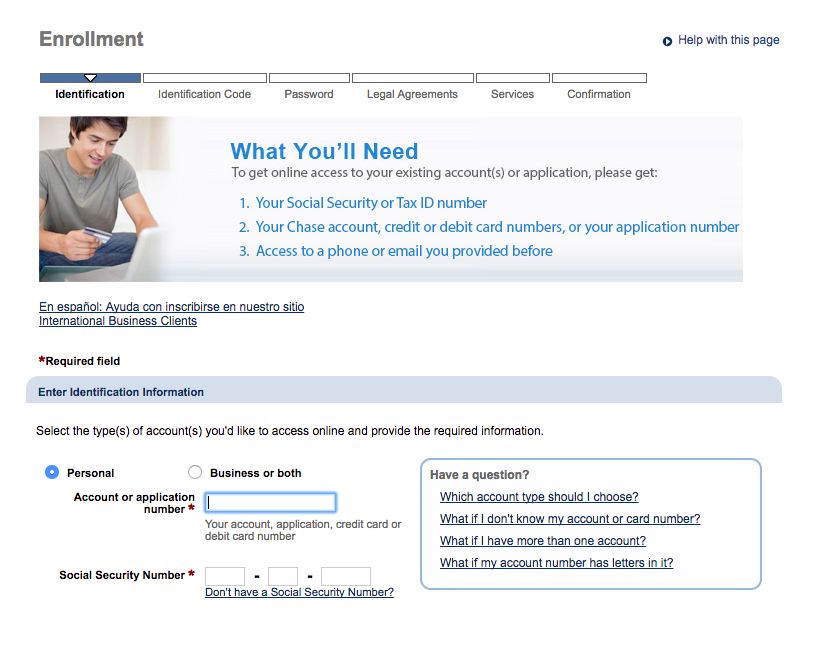
Chase uses default browser focus states (Chrome)
Source: W3C
Forms and Inputs
When it comes to asking users to input information be CLEAR. Let users know up front what information they will need to provide - as well as success criteria. Rule of thumb is to not rely on color to indicate errors alone, utilize text to describe the error and add visual cues when possible.
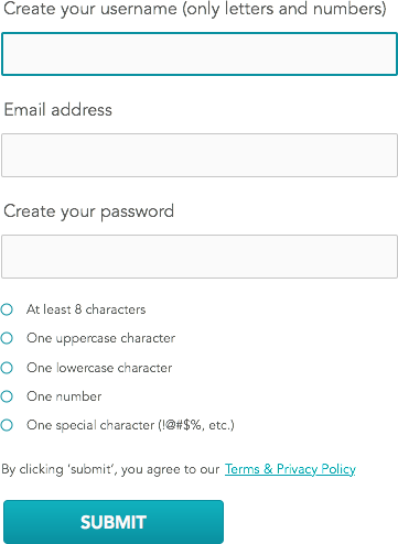
Mockup: Example of a form showcasing some accessibility best practices.
Source: W3C
Opt for clicks instead of hovers
For users with motor disabilities, trying to land on a small icon or hovering to expose navigation will be a daunting task. In cases of main navigation and key functions, opt for clicks as the main interaction. You definitely do NOT want to hide things behind a hover. See example below:
Mockup: Example of showing functionality on hover. User has no idea of function without hovering.
Mockup: A possible solution - lighter gray to hint of functionality, becomes pronounced on hover.
Alt text for images
Visually impaired users rely on screen readers to navigate and read the website so it's important that when the focus is on an image, an alt text should be in place as a backup. The goal is to establish context to the image at hand.
Source: WebAim
Color cannot be the only way to distinguish important information
Let's say the website was black and white how else would you convey content of importance? Since color can't be the solution (text color, color blocking, etc.), other ways to convey importance like iconography, underlines and div lines can be used.
Source: UCLA
Consistency is the key
For cognitive impairments, being able to identify each section clearly can be a challenge if consistency is not considered. Are functions clearly presented? Are labels clear? Are sections divided by section headers?
The goal is to have a solution that is a breeze to navigate and content that is easily recognizable and processed. Site nomenclature can fall into this as well, no need to get too creative - make it CLEAR.
Can't make it accessible? Make an alternate solution
If a certain component is created to be interactive in a way that cannot be accessible (interactive experiences, maps, animations, etc.), then consider making a screen reader-friendly alternative. An alternative to videos are links to transcripts, perhaps describing the experience to those users can be a good starting point.
The Wrap-Up
The major takeaway here is that these limits really aren't limits at all. They're an opportunity to come up with more creative ways to design interactions. Best part about it - you end up with a design that reaches a wider audience and will get kudos from any steering committee.