

As a digital consultant with experience across major enterprise CMS platforms, I recently took the opportunity to build a new demo site using Storyblok. The goal was simple: evaluate a modern, headless CMS through the lens of someone who's worked extensively with Sitecore XP and Sitecore XM Cloud, two powerful but complex platforms.
The result? A streamlined, API-first experience with flexible content delivery, clean JSON structures, and a drastically reduced time to market - all backed by a strong visual editor that supports component-driven frontend architectures.
From Zero to Live in Hours
Here’s what stood out during implementation:
Simplicity of Setup
Using Storyblok's CLI and the official Next.js starter, I had a dev environment running in minutes. No Docker, no SQL Server - just npm install, token auth, preview config, and I was live before lunch.
Component-Based Thinking
Storyblok's nested blok structure fits naturally into modern frontend architecture. I registered components via storyblokInit() and rendered them dynamically using a DynamicComponent switch. This created a seamless bridge between backend content and frontend components.
Visual Editor That Just Works
Next.js preview integration was seamless. After configuring the preview token, live content editing was available instantly - no proxy services or Experience Editor setups like in Sitecore.
How Storyblok Changed My Dev Workflow
Moving from Sitecore's item-based system to Storyblok's JSON-first approach made clear the advantages of decoupled content. The APIs return fully structured and resolved data, eliminating the hassle of traversing item trees or using tools like Glass Mapper.
For example, to render a dynamic hero section in Next.js, I simply called the /cdn/stories/home endpoint, mapped over story.content.body, and render components using a resolver function. In Sitecore, this same experience would require a custom layout, placeholder registration, field binding, and serialized content items - and often additional Helix layer configuration.
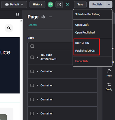
Additionally, the content's JSON is available directly in the editor. I prefer this convenience to Sitecore's layout service URL strategy: https://<your-sitecore-instance>/sitecore/api/layout/render/jss?item=<item-path>&sc_lang=<language>&sc_apikey=<your-api-key>. But if you prefer the URL, you can still do that like this: https://api.storyblok.com/v2/cdn/stories/<content-path>?version=<draft-or-published>&token=<your-api-token>
Real-World Example: Header/Footer as Shared Components
Storyblok makes reusability effortless. I created header and footer stories under a /shared folder and loaded them globally in _app.tsx:
This was drastically simpler than Sitecore's shared component model, which requires layout definitions, field rendering logic, and placeholder setup.
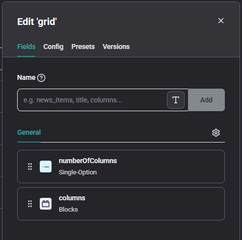
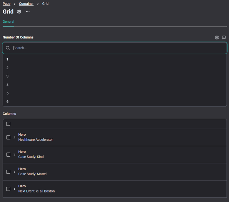
Nested Components with Grid Block: A Sitecore Placeholder Parallel
Storyblok supports nesting dynamic components in a way that directly parallels Sitecore's placeholder model - but without the overhead. In Sitecore, this would involve a data template, rendering parameters, allowed renderings, and placeholder keys. Storyblok handles it all within the block configuration and Visual Editor.
Code: The section of code highlighted in gray demonstrates the nested components
Block: The block in Storyblok serves as the central place for defining fields for a component or widget. This contrasts with Sitecore, where similar configuration is spread across data templates, renderings, and placeholders.
Content: This is how the block and its fields will be presented during content entry.
Comparing Storyblok and Sitecore
| Capability | Sitecore XP | Sitecore XM Cloud | Storyblok |
| Architecture | Monolith with CM/CD roles | Cloud-hosted but legacy-based | Fully headless, API-first |
| Infrastructure | Requires Solr, MongoDB, SQL | Simplified but still needs CLI and templates | Zero setup, no servers required |
| Content Modeling | Items, fields, presentation details | Same, with YAML serialization | Schema-based JSON blocks |
| Developer Workflow | Heavy DevOps, Helix structure | Improved but CLI-dependent | CLI optional, fast iteration |
| Visual Editing | Experience Editor | Pages (Page Builder) | Real-time editing with live preview |
Where Storyblok Shines
- Developer Velocity - Hot reload, live preview, no DevOps blockers.
- JSON-First Content - Clean, structured, and deeply nestable.
- Schema Flexibility - Evolve types freely without coupling to templates.
- Modern Visual Editor - Built for frameworks like Next.js and Nuxt.
- Built-in Localization - i18n-ready with region-aware schemas.
For modern JAMstack sites, marketing microsites, or MVP builds, Storyblok is often the faster, leaner, more flexible choice.
Final Thoughts
Building with Storyblok re-centered my development process around speed, flexibility, and clean architecture. If you're evaluating composable CMS platforms - and have felt the weight of Sitecore's legacy complexity - Storyblok is absolutely worth exploring. It's a nimble, modern CMS that aligns with today's front-end-first mindset.