

Welcome back to part 2 of implementing image focal points in Sitecore XM Cloud! In this final installment, we'll explore how to integrate the focal point coordinates with your Next.js components to achieve perfect image rendering across all devices.
Quick Recap: What We've Built So Far
In Part 1 of this series, we established the foundation for our focal point solution by creating a custom field structure in Sitecore XM Cloud. Since XM Cloud's architecture doesn't support the same backend customization as Sitecore XP, we developed a practical workaround.
The Custom Field Approach
For each image field requiring focal point functionality, we created two companion fields to store the focal point coordinates:
- {field name} CX – The X-axis coordinate (horizontal position)
- {field name} CY – The Y-axis coordinate (vertical position)
These fields store percentage values (0-100) that represent where the focal point sits on the image. For example, if your image field is called Hero Image, you would create:
- Hero Image CX
- Hero Image CY
We also built a standalone focal point picker tool — a Next.js page that allows content editors to visually select focal points and get the exact CX and CY percentage values to enter into Sitecore. This tool provides visual selection, precise input fields, live previews at different sizes, and CSS output showing the exact object-position values.
Now that content editors can set their focal point coordinates in Sitecore, let's dive into how to implement these values in your Next.js components.
Part 2: Implementing Focal Points in Your Next.js Components
Once content editors have set their focal point coordinates in Sitecore, implementing them in your components is straightforward. The magic happens in how we use the CX and CY values with the JssImage component.
Basic Implementation
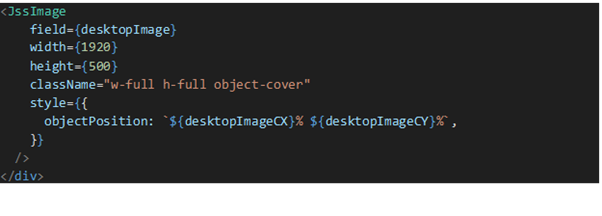
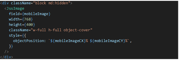
You will need to tweak your GraphQL queries to fetch the image companion fields we created in Sitecore for a given component. Then here's how you use the focal point coordinates with the JssImage component:
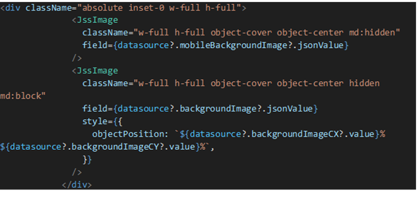
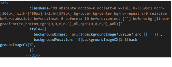
For Background Images:
Key Implementation Points
Let's break down the critical elements that make this work:
- Object-Position Style — The
object-positionorbackground-positionstyle property tells the browser where to anchor the image within its container. By using our CX and CY percentage values, we ensure the focal point remains visible regardless of how the image is cropped. - Browser-Native Rendering — All cropping and positioning is handled automatically by the browser. There's no JavaScript calculation, no performance overhead — just clean, efficient CSS.
Handling Multiple Images
When working with components that have multiple images (like a banner with different images for mobile and desktop), each image can have its own focal point.
The Complete Workflow in Practice
- Upload Image – Editor adds an image to the standard Sitecore image field
- Access Picker Tool – Editor opens the focal point picker tool
- Upload to Picker – Upload the same image to the picker
- Set Focal Point – Click the most important area of the image
- Preview Different Sizes – Validate across layouts
- Copy Values – Copy CX and CY percentages
- Enter in Sitecore – Paste values into CX and CY fields
- Publish – The image renders correctly on the live site
Default Values
Always provide fallback values when editors haven't set focal points:
const heroImageCX = fields?.heroImageCX?.value || 50;
const heroImageCY = fields?.heroImageCY?.value || 50;
Setting defaults to 50, 50 centers the image, ensuring reasonable display even without explicit focal point selection.
Performance Considerations
- Use appropriate image sizes
- Implement lazy loading for images below the fold
- Leverage Next.js Image Optimization
Responsive Design
- Different focal points for different breakpoints
- Different images for mobile and desktop
- Or a single focal point that works across all sizes
Benefits of This Implementation
- No Backend Customization Required
- Visual and Intuitive
- Framework Agnostic
- Maintainable
- Performant
- Flexible
Conclusion
By combining custom Sitecore fields, a purpose-built focal point picker tool, and straightforward Next.js implementation, we've successfully replicated the Advanced Image functionality that content editors relied on in Sitecore XP — all within XM Cloud's headless architecture.
The beauty of this solution lies in its simplicity: editors get a visual tool for selecting focal points, and developers implement them with just a few lines of CSS — no complex calculations, no performance overhead, and no maintenance burden.