

In this post, I’ll walk you through the hands-on process of building a styled, reusable Featured Card component using Sitecore XM Cloud’s Component Builder. The goal is to demonstrate how developers and marketers can visually create components while enforcing a consistent design system.
This tutorial focuses on: +
- Structuring a component with layout and content elements
- Applying visual styles like typography, colors, and spacing
- Creating reusable themes and collections for efficiency and consistency
This step-by-step guide supports the high-level concepts introduced in the previous post, where I discussed why this approach matters and what I learned from it.
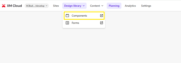
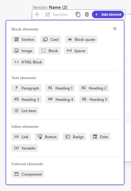
Create a Component Using the Component Builder:
Navigate to the Design Library section within the app, then select Components to begin creating or editing a component.
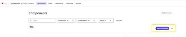
Click on “Add Collection” to add your custom collection. Provide a collection name, then click Save to create it.
Now, click on “Add Component” under the collection you created. Enter the component name and an optional description, as needed.
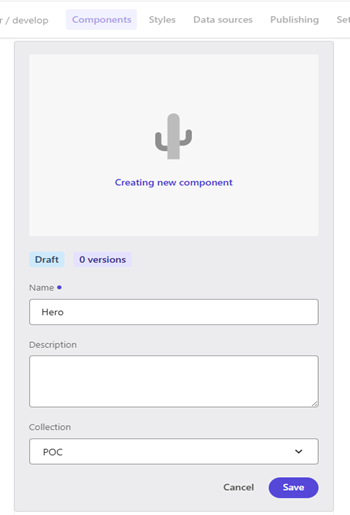
Click on the component to edit it. You can create your BYOC (Bring Your Own Component) and insert predefined HTML elements as part of its structure.
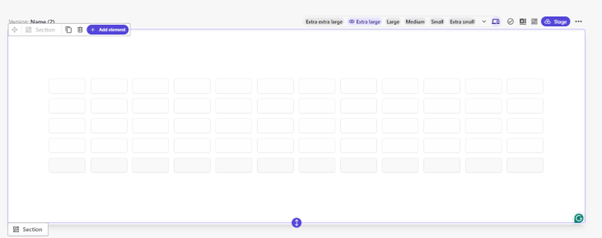
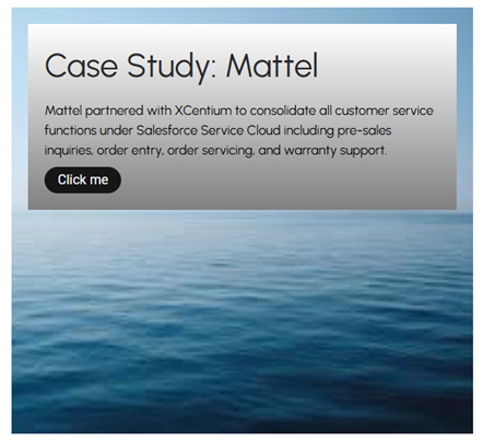
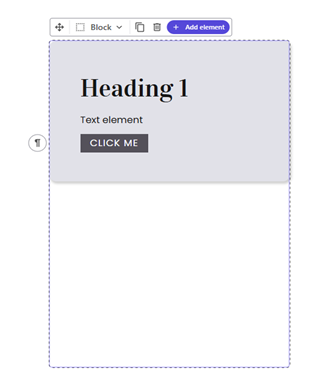
Let’s go ahead and create this component—refer to the image below—and apply styling to it as well.
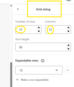
Adjust the Layout Grid Change the default grid from 5 columns to 12 columns under “Grid Sizing” in the Stylespanel on the right-hand side. This gives you better control over layout and spacing.
Add a Section
- Select the area within the grid where you want your component to appear.
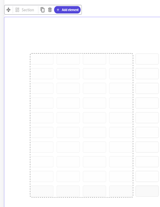
- Click Add Element and choose Section.
- Use “Append inside” to nest it within the selected area.
Insert a Card
Inside the section, add a Card element to act as the container for your content.
Add Content Elements
Within the Card, add the following elements:
- Heading: For example, “Case Study: Mattel”
- Paragraph: Include a short description of the case study.
Button: Add a call-to-action, e.g., “Click me”
Styling the component:
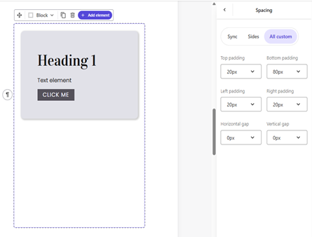
Let’s start by adding padding to the section, ensuring that the card aligns properly within the layout.
Next, select the block within Component Builder and apply the appropriate padding as shown in the screenshot below, by selecting Spacing section on styles, resulting in consistent spacing and a well-aligned card appearance.
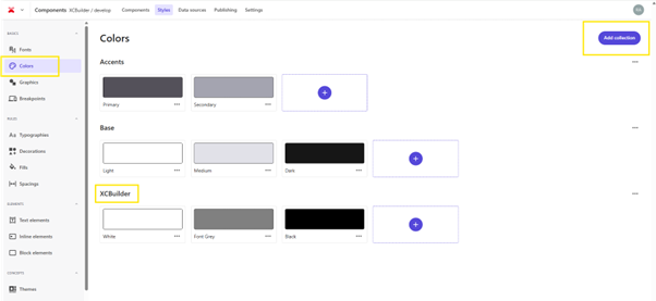
To add more styles, select the Styles tab from the header section in Component Builder. For our component, we’re primarily using black, grey, and white for the text and card styling. To manage this consistently, add these colors to the Colors section in the Styles tab. You can also create a new color collection named XCBuilder to group all project-specific colors in one place, and included black, white, and grey in this collection for easy reuse.
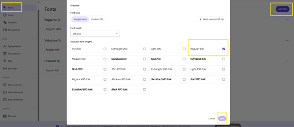
Since our design requires the Urbanist Regular 400 font, it is added it to the Fonts section to ensure consistent typography across the component.
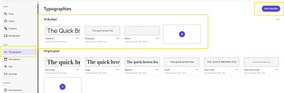
To keep the typography organized and consistent, click on the “Add collection” button at the top right of the Typography panel and create a new collection named XCBuilder.
This helps centralize all project-specific text styles for easy reuse across components.
Within the XCBuilder collection, add styles using Urbanist Regular 400 to match your design requirements:
- Headline 1 – 40px
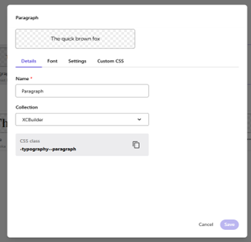
- Paragraph – 16px
Button – defined using rem units for responsive scaling
This setup ensures all components maintain consistent font usage and makes styling more efficient going forward.
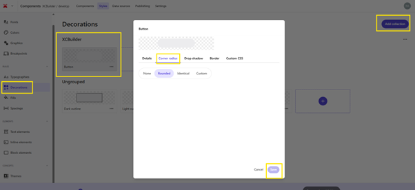
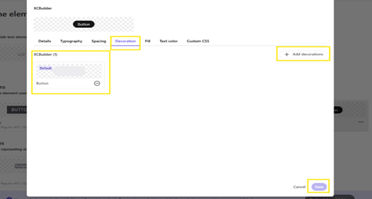
Click the “Add collection” button in the top-right corner to create a new decoration group named XCBuilder. Within this collection, add a Button decoration and navigate to the Corner radius tab. Select the Rounded option to give the button a smooth, pill-shaped appearance. Additional styling such as Drop shadow, Border, or Custom CSS can also be configured if needed. Once the desired shape is set, click Save to finalize the decoration style for consistent reuse across components.
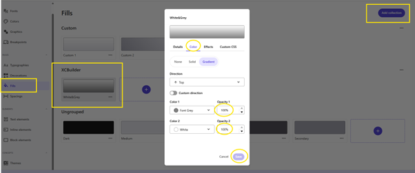
Navigate to the Fills section under the Rules category in Component Builder. Click the “Add collection” button in the top-right corner to create a new fill group named XCBuilder. Within this collection, define a custom fill style called White&Grey.
This fill is used specifically as the background color for the card component.
In the fill settings, go to the Color tab and select the Gradient option. Set the gradient direction to Top, then configure the two colors:
- Color 1: Font Grey, with 100% opacity
- Color 2: White, with 100% opacity
This creates a smooth top-to-bottom gradient that can be reused across components to maintain a cohesive visual style. Once the gradient is configured, click Save to finalize the fill style.
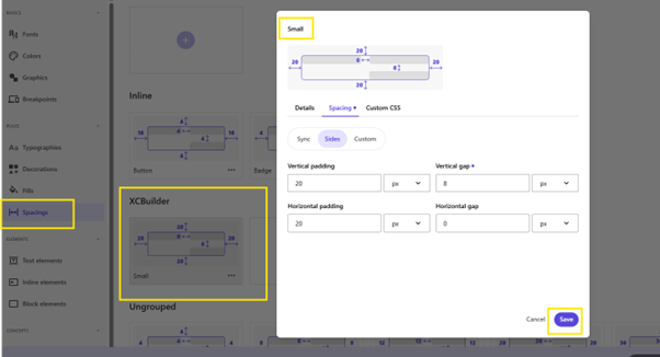
Defining Reusable Spacing Styles
- Go to the Spacings section under the Rules panel in Component Builder.
- Click “Add spacing” and create a new spacing style named Small under the existing XCBuilder collection.
- In the spacing configuration:
- Set top, bottom, left, and right padding to 20px.
- Set vertical gap to 8px.
- Set horizontal gap to 0px.
Click Save to store the style.
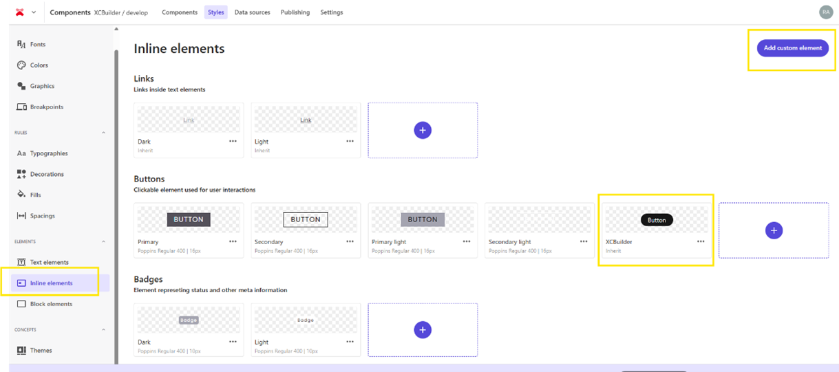
Add a Custom Button Style
- Navigate to the Inline elements section under the Elements panel in Component Builder.
- Click the “Add custom element” button in the top-right corner.
- Under the Buttons category, create a new custom button style and name it something recognizable—e.g., XCBuilder.
- Apply the necessary styling for:
- Font (e.g., Urbanist Regular 400)
- Color (black or your defined theme color)
- Padding, decoration, or any other inherited styles set earlier in your typography, fills, or spacing collections.
Click Save to finalize the button style.
Apply Spacing to a Block Element
- Go to the Block elements section under the Elements panel in Component Builder.
- Select the block element (e.g., Cards) you want to style.
- Click on the Spacing tab in the top navigation.
- Under the XCBuilder collection, choose the Small spacing style you created earlier. This style includes 20px padding on all sides and an 8px vertical gap between stacked elements.
- Click Make default if you want this spacing to be applied automatically whenever the block is used.
Finally, click Save to apply the changes.
This setup ensures your block component maintains consistent spacing across different pages and aligns with the overall design system defined in the XCBuilder style set.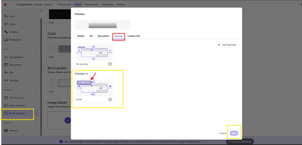
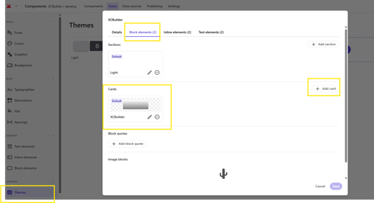
Apply Existing Card Style Through Themes
- Navigate to the Themes section under the Concepts panel in Component Builder.
- Open the working theme (e.g., XCBuilder) and go to the Block elements tab.
- Under the Cards section, click “Add card”.
- From the list of available card styles, select the existing one created earlier that includes the predefined spacing, fill, and decoration settings (e.g., the one labeled XCBuilder).
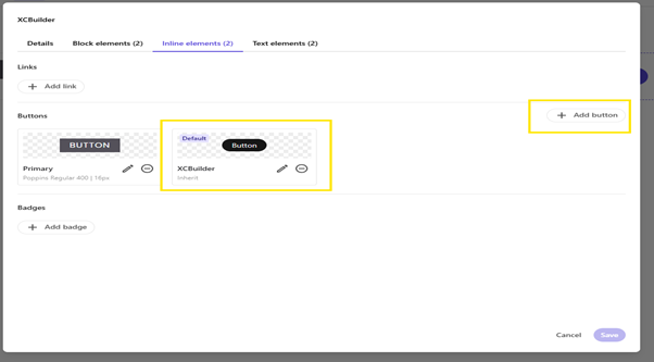
- Switch to the Inline elements tab.
- Under the Buttons section, click Add Button. Select the existing XCBuilder button style that was configured earlier with font, fill and decoration settings.
- Set it as Default to apply it consistently wherever buttons are used.
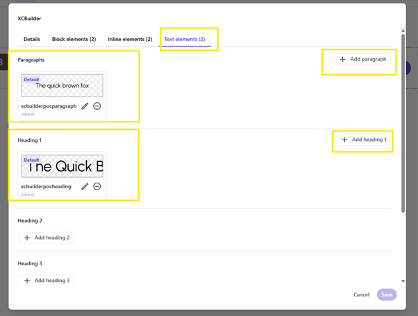
- Under Paragraphs, click Add paragraph and select the existing paragraph style (e.g.,xcbuilderpocparagraph) defined with Urbanist Regular 400.
- Under Heading 1, click Add heading 1 and select the custom heading style (e.g., xcbuilderpocheading) configured for section tiles.
- Mark both as Default to automatically apply them across components.
Click Save to confirm all the changes.
After making changes to the style library (such as adding fills, typography, spacing, or component styles), those updates must be staged and published for them to take effect.
Step 1: Go to Style Publishing
- A message appears at the top: “You made changes to the style library...”
Click the “Go to style publishing” button to proceed.
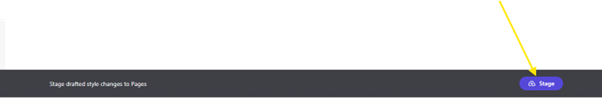
Step 2: Stage Changes
- In the publishing panel, locate the Stage button at the bottom-right corner.
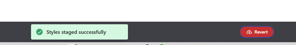
- Click Stage to draft the latest style changes into Pages.
A success message “Styles staged successfully” confirms the staging is complete.
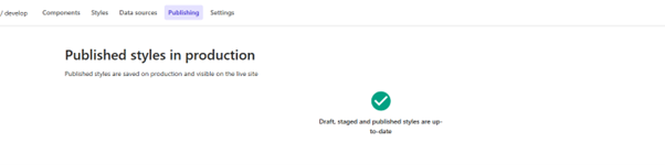
Step 3: Publish Styles
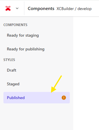
- Navigate to the Published section under STYLES.
- If a warning icon appears (🟠), it means styles are staged but not yet published.
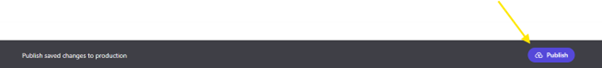
Click Publish to push the staged styles to the live production environment.

- Once all styles are published, go to the Component Builder, select the component, and open it to update the following content fields.
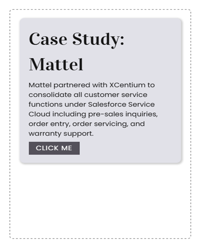
- Heading: Change to Case Study: Mattel
Paragraph: Add the following text:
Mattel partnered with XCentium to consolidate all customer service functions under Salesforce Service Cloud including pre-sales inquiries, order entry, order servicing, and warranty support.
Button Text: Update to
CLICK ME
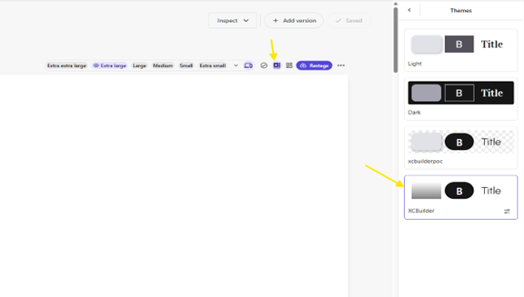
Click on the Theme icon at the top and select the XCBuilder theme from the panel that appears on the right.
Now the styles have been successfully applied to the component, and it appears as shown below.
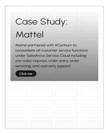
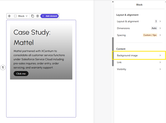
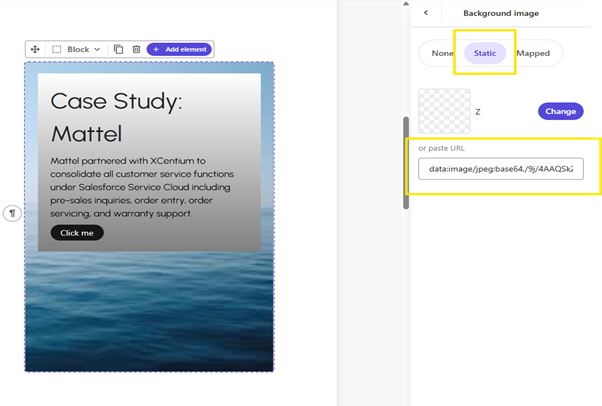
To apply a background image, select the component block, go to the Background image settings, choose the Static option, and paste the image URL into the provided field.
Click on the Stage/Restage button at the top, then proceed to publish your changes to make them live.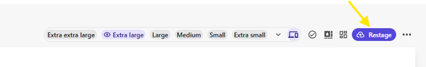
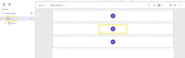
Now, Go to Page Builder to add the components to your page.
Once inside the Page Builder, navigate to the Home page and add the component to the main section by clicking the plus (+) icon.
Once inside the Page Builder, navigate to the Home page and add the component to the main section by dragging and dropping the component from component section.
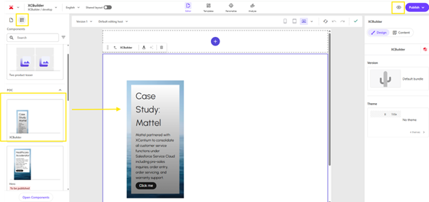
Once the component is appended, you can on the preview button at the top to see the result.
Summary:
This blog explained how to create and style a component using the Component Builder, enabling you to quickly design, customize, and reuse branded components with consistent visuals. It also streamlines collaboration between developers, designers, and marketers, helping deliver on-brand experiences more efficiently across the website.